
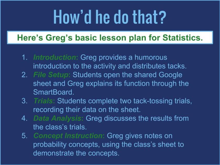
Northview math teacher Greg Christy opens his AP Statistics class with a simple question: “Have you all had your tetanus shots?” After one lost soul asks, “What’s a tetanus shot?” Greg begins distributing thumb tacks. He jokes a little about this lesson being “the most dangerous thing you’ve done today, maybe all year,” but he quickly moves past these quips to instructions for the lesson. Students will use these thumb tacks to explore the move from randomness to probability, a chapter 14 lesson. And while doing that, they will use simple, yet powerful spreadsheet tools in Google Sheets to calculate.
Here’s the sequence: Greg has created a spreadsheet and shared it with all of his students, giving them edit access. He displays it on the SmartBoard and they open it on their Chromebooks. Then, the students toss the tacks at their desks for a trial of twenty tosses, laughing as they do so, but recording the results carefully. On the shared sheet, they record the percentage of “tips up” landings in the column next to their name. A second trial of twenty tosses follows with a second entry. As the students enter data, it appears on the class screen live, as does another number, the long-run relative frequency of “tips up” landings. Greg has designed the sheet to calculate the average percentage of these landings, and as the numbers keep flowing in, the percentage evens out to about 63%.
The practical test and collaborative data recording have given Greg the introduction he needs to discuss several concepts in probability and statistics, such as trial, outcome, sample space, Law of Large Numbers, empirical probability, and theoretical probability. All the while, he goes back to the Google sheet, explaining the meaning behind the numbers. He adds to that discussion by pulling up graphic representations through histograms and Google’s new “Explore” feature in sheets. Using the latter, students can see how trials over a space of time even out to a nearly flat line. The numbers in the original sheet become empirical probability, and the tossing of tacks becomes a conceptual reality for these students.
By using Google sheets and the collaborative spreadsheet power they provide, Greg has brought students into the development of large number data to yield conclusions regarding probability. Rather than reading these results passively, or watching a demonstrated trial, the students participate in the work in real time with immediate impact. Greg extends that engagement when he shows students how to generate long lists of random numbers on their own sheets with the “randombetween” function. Even this little trick helps students visualize the concept. As Greg says, “It helps them to make a connection conceptually with what they’re doing analytically.”

That connection does not just happen in AP Statistics, though. It also happens in AP Calculus. The day before the tack lesson, Greg was helping his AP Calculus students visualize the concept underlying polynomial function rate of change. Students are familiar with these concepts (e.g. derivative, concave up/down, decreasing/increasing) and are ready to graph the rate of change of a function based on its graph. Today, Greg does not rely on Google, which is too general for calculus. Instead, he relies on NCTM’s Illuminations resources.

At the SmartBoard, Greg models the Interactive Calculus Tool available in Illuminations. Students follow on their Chromebooks as he graphs the function and then tries to anticipate the derivative. Once he has shown them, he asks that they create their own function graphs to trade with partners for derivative graphing. The students love this step, and one hands his Chromebook to the student behind him with a smile and a warning: “This is brutal.” Everyone tries to graph the derivatives for the polynomials given to them as Greg circulates and answers questions. As the class progresses, students work a problem described on the handout Greg gave them.

So what’s the big deal here, and is it big? These two lessons might beg a math teacher to ask how going digital with either Google or Illuminations has significantly improved the learning experience for these AP students. According to Greg, “We do a lot with analytical equations. That’s by hand. Our technology allows us to take those equations and create graphs of those. That’s all based on analytical methods, but with those analytical methods, the students don’t get an intuitive feel for what’s happening.” As he explained before, the students are better able to grasp the concepts when manipulating them through dynamic digital tools. The concepts, which may be elusive when navigating complex equations, appear clearly on the screen. On the AP Calculus test, Greg explains that the test asks “questions on a conceptual basis . . . There’s not a lot of it that’s just rote mechanical operations. Even though the testing environment is traditional, the conceptual foundation still needs to be there. It does transfer. If it didn’t, I wouldn’t do it.”
These digital tools are not simply relevant to Greg’s AP classes. NCTM offers Illuminations content to a wide range of math classes and skill levels. Google Sheets can help student visualize mathematical relations with similar variety. Greg has simply shown how digital interaction provides easy and powerful tools for working with numbers in a hands-on, engaging fashion.

Follow these links for more information!
NCTM Illuminations YouTube Channel
NCTM Illuminations Function Matching Tool (Excellent tool for a wide range of secondary math classes)


